


Festivals and Event Services Inc. – Event Icons Program
Icons & Ontario Events: Why the Bright Idea Hasn’t Quite Caught On, and Why It Should
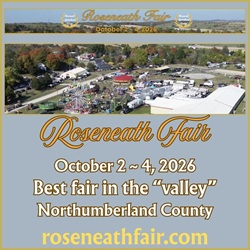
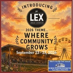
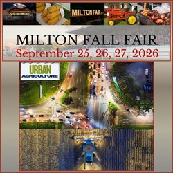
Ontario’s big fairs and festivals excel at storytelling, colourful posters, stacked line‑ups, mouth‑watering food photos, but when it comes to quick, at‑a‑glance amenity information, most still rely on dense text or downloadable PDFs. Only a handful, such as the Royal Agricultural Winter Fair and the Canadian National Exhibition (CNE), embed icons—and even they confine them to printed or PDF site maps rather than the main event webpage or ticket flow.
![]()
Why icons end up locked inside a map
- Legacy print thinking – Many Ontario fairs evolved from century‑old agricultural societies. Their communications teams are comfortable producing the traditional “folding map.” Icons feel like a graphic design element that belongs in that medium, not on the dynamic web.
- Seasonal budgets & bandwidth – A festival website may live for only a few months. Hiring designers to craft a cohesive, accessible icon set (and a developer to implement tooltips, alt text, and responsive layouts) can slide down the priority list behind talent booking or sponsorship sales.
- Template limitations – A surprising number of event sites run on off‑the‑shelf ticketing or association CMS templates that lack a built‑in icon library, making any custom work feel “extra.”
- Fear of clutter – Organizers worry that too many symbols competing with lineup or sponsor logos will overwhelm small screens.
![]()
Why the icons matter
Icons distil need‑to‑know logistics into seconds of comprehension, exactly when visitors are deciding whether to attend, how long to stay, and what to bring. They can:
| Benefit to Visitors | Benefit to the Event |
| Accessibility – Visitors with mobility challenges instantly spot wheelchair‑friendly gates or paved paths. | Reduced inquiries – Fewer email and social‑media questions about parking, ATMs, or stroller rentals free staff time. |
| Confidence – Parents see baby‑change stations and pack accordingly. | Upsell opportunity – “VIP Tent” or “Camping Showers” icons double as subtle upgrades. |
| Way‑finding – On‑site, consistent symbols link web, signage, and maps, shortening queues and improving flow. | Inclusivity & brand trust – Demonstrates attention to diverse guest needs, increasing positive reviews. |
![]()
Lessons from hotels and attractions
Tourism businesses that operate year‑round, hotels, resorts, museums, treat amenity icons as UX table stakes. Open any major chain’s Ontario property listing and you’ll see a tidy grid of symbols for free Wi‑Fi, EV charging, pet‑friendly rooms, etc.; even without custom graphics, the bullet‑point list is usually preceded by small SVG or font icons in the CSS. Their motivation is clear: every friction‑free booking means revenue 365 days a year. Events have the same customer‑experience stakes, just on a compressed timeline; the cost‑benefit ratio is actually higher because guests have fewer chances to get information wrong.
![]()
What’s holding Ontario events back?
- Short life cycles mask long‑term gains. An icon library built once can be reused each season with minimal update cost.
- Assumption that “everyone will download the map.” In reality, most visitors skim the homepage on mobile and never scroll to file links.
- Accessibility misconceptions. Some organizers fear icons alone aren’t WCAG‑compliant. True, but pairing each icon with a 2–3‑word label and aria‑label text solves that instantly.
- Design paralysis. Without provincial or industry‑standard sets, events worry about “reinventing the wheel.” (A shared Ontario Events icon pack would eliminate this hurdle.)
![]()
Practical steps to unlock the value
- Start with the “Big Five.” Pick the five make‑or‑break amenities for your audience, often Accessible Restrooms, Free Parking, ATM, Covered Seating, Food Vendors. Place them directly under the hero image and in ticket checkout.
- Reuse on every platform. The same SVG set should power your website, digital ads, social tiles, printed signage, and pdf map. Consistency breeds instant recognition.
- Leverage open‑source libraries. Font Awesome, Iconify, or Noun Project offer accessible, modifiable symbols, no need to commission from scratch.
- Validate with analytics. Track click‑throughs on an “All Amenities” CTA; events that have piloted icon‑first layouts often see lower bounce rates and shorter “time‑to‑purchase.”
- Collaborate through associations. OAAS (Ontario Association of Agricultural Societies) or regional tourism boards could host a shared icon toolkit, spreading cost and ensuring brand harmony across the province.
![]()
Final thought
Ontario’s festivals and fairs already compete on experience, fresh food, live music, rural heritage. Transparent, icon‑driven communication is the low‑cost, high‑impact upgrade that aligns visitor expectations with on‑site reality. If hotels have taught us anything, it’s that icons aren’t decoration; they’re shorthand for trust. By bringing them out of the PDF and into the hero strip, Ontario events can turn curiosity into confident clicks, and welcome happier, better‑prepared guests through the gate.